The accessibility audit that changed the architecture: 67.6% failures as the argument for Tier 2
We audited 105 Storybook stories with axe-core and found that 67.6% failed WCAG AA. The root cause wasn't the components — it was two token values.
Accessibility is one of those topics frontend teams defer with good intentions. "We'll review it before launch," "we'll leave it for when we have more component coverage," "it's not a priority right now." I've heard it many times. I've said it myself.
When we started the design system rebrand, accessibility was mentally filed as a refinement item — something that would get done after migrating the tokens, after updating the MUI theme, after the "real" work. What I found when I ran the formal audit forced me to revise that hierarchy. Not because the numbers were bad (although they were), but because the numbers pointed at something deeper: the problem wasn't in the components, it was in the token architecture.
That pivot — from "we have components with contrast problems" to "we have a missing semantic layer that causes 80% of the failures" — ended up being one of the strongest arguments for including Tier 2 in the Phase 1 roadmap, not as a nice-to-have but as necessary infrastructure.
The methodology
The audit ran on Storybook v8.6, which was already set up with @storybook/react-vite and addon-essentials. What wasn't installed — and was part of this audit's work — was @storybook/addon-a11y. I installed it, configured it to run automatically on every story, and then used axe-playwright to execute an automated pass over the 105 component stories.
The reference standard was WCAG 2.1 AA. It's not the strictest standard out there (AAA requires 7:1 contrast ratios for normal text), but it's the one most legal and regulatory contexts take as the minimum acceptable, and the one that directly applies to a fintech platform.
What axe-core detects in this context is violations of specific rules. It doesn't evaluate "how accessible the interface feels" — that judgment requires real users with assistive technologies. What it does do is flag objective violations: elements with insufficient contrast, images without alt text, interactive controls without accessible names. They're the floor, not the ceiling.
The flow was simple:
- Install
@storybook/addon-a11y+axe-playwright - Run
npx nx test-storybook componentswith WCAG 2.1 AA tags - Export the violations report per component
- Classify by rule ID, impact level, and affected components
The results
The number that stopped me was this: 71 of 105 stories failed WCAG AA. That's 67.6%. Less than a third of the component library passed the audit.
| Component | Stories | Result | Violations |
|---|---|---|---|
| Alert | 4 | FAIL | color-contrast (serious) |
| Autocomplete | 10 | FAIL | color-contrast (serious) |
| Avatar | 6 | FAIL | color-contrast (serious), image-alt (critical) |
| Button | 7 | FAIL | color-contrast (serious — CustomButton story) |
| Dialog | 4 | PASS | — |
| LanguageSelector | 3 | FAIL | aria-input-field-name (serious) |
| LogoController | 4 | PASS | — |
| PhoneInput | 5 | FAIL | aria-input-field-name (serious), color-contrast (serious) |
| ProgressBar | 4 | FAIL | aria-progressbar-name (serious), color-contrast (serious) |
| RadioGroup | 7 | FAIL | color-contrast (serious), aria-prohibited-attr (serious) |
| Select | 8 | FAIL | aria-input-field-name (serious), color-contrast (serious) |
| StatusComponent | 4 | FAIL | color-contrast (serious), button-name (critical) |
| Stepper | 7 | FAIL | color-contrast (serious) |
| TextField | 8 | FAIL | color-contrast (serious) |
| Tooltip | 3 | PASS | — |
12 of 15 components had violations. Only Dialog, Tooltip, and LogoController came out clean.
The full catalog of violations broke down like this:
| Rule ID | Impact | WCAG Criterion | Affected components |
|---|---|---|---|
color-contrast |
Serious | 1.4.3 AA | 11 components |
aria-input-field-name |
Serious | 4.1.2 AA | LanguageSelector, PhoneInput, Select |
aria-progressbar-name |
Serious | 4.1.2 AA | ProgressBar |
aria-prohibited-attr |
Serious | 4.1.2 AA | RadioGroup |
image-alt |
Critical | 1.1.1 AA | Avatar |
button-name |
Critical | 4.1.2 AA | StatusComponent |
Critical violations are the most urgent by definition: an <img> without alt in Avatar means a screen reader user gets no information about that image. An icon button without aria-label in StatusComponent is directly inoperable for people navigating with keyboard or AT. Those two were flagged P0 for immediate fix regardless of the bigger plan.
But the category driving the volume is color-contrast. Present in 11 of the 12 failing components. To understand why, I had to go down to the tokens.
The root cause
When you have the same violation in 11 different components, the first thing you rule out is that it's a per-component issue. The probability of 11 teams independently making the same incorrect decision is low. Much more likely: they're all using the same source value.
That's what was happening. The analysis of the foreground/background pairs that axe was flagging always pointed to the same tokens:
neutral.400  →  #9F9F9F  on white #FFFFFF  →  ratio 2.85:1
primary.750  →  #677897  on white #FFFFFF  →  ratio 3.80:1
The WCAG AA minimum for normal-size text is 4.5:1. Both values are significantly below.
Where were they used? In every "secondary" visual role of the input system: floating labels in resting state, placeholders, helper text, disabled text. The Material Design visual pattern separates "active" text from "supporting" text using softer colors — and in our theme, that visual softness was implemented with tokens that had never been run through a contrast checker.
/* What existed — Tier 1 primitives with no semantic intent */
--neutral-400: #9F9F9F;   /* ratio 2.85:1 vs white — FAIL */
--primary-750: #677897;   /* ratio 3.80:1 vs white — FAIL */

/* Where they were applied in the MUI theme */
MuiInputLabel: {
  styleOverrides: {
    root: {
      color: palette.primary[750],  /* floating label at rest */
    }
  }
}
MuiInputBase: {
  styleOverrides: {
    input: {
      '&::placeholder': {
        color: palette.neutral[400],  /* placeholder */
      }
    }
  }
}
There was an additional contributing factor, though less direct: the typography change. The previous system used Montserrat, and the transition to DM Sans + Inter as part of the rebrand altered perceived contrast in some contexts. Montserrat has more visual weight in certain variants, which made some grays "look" more legible without technically being so. DM Sans, being a more modern and geometric font, exposes that weakness more clearly. It's not a violation cause on its own, but it's a factor that makes the fix more urgent once the font changes.
Other pairs also failed, but they're contextual and less systemic:
error.900   (#F33954)  on  error.500  (#FFE9ED)  →  3.1:1   — FAIL
success.900 (#6BC25C)  on  success.500 (#EFFCEE)  →  2.2:1   — FAIL
white       (#FFFFFF)  on  success.900 (#6BC25C)  →  4.4:1   — FAIL (marginal)
These affect specific cases of Alert and Button with success variant. They're point fixes that don't imply architecture. The neutral.400 and primary.750 ones do.
Why patching components was the wrong answer
The most obvious operational response when you have 11 components failing the same test is to open 11 tickets and fix each component. It's what a team that treats accessibility as a list of bugs would do.
The problem with that approach is that it doesn't fix anything — it hides it.
If you fix the color in the MUI override for TextField, you're going to hardcode a value that passes the ratio: #767676, the lightest gray that exceeds 4.5:1 on white. That fixes TextField. But PhoneInput still uses neutral.400. So does ProgressBar. So does Stepper. And when someone adds a new component next month, how do they know they can't use neutral.400 for helper text? There's no mechanism preventing it.
The system has 95 Tier 1 tokens — primitive values with no semantic intent. They're the equivalent of having a color palette without roles: you know neutral.400 exists and what it looks like, but you don't know what it's for or what contrast guarantees it provides.
What's missing is a semantic layer. Tokens that don't describe a color but a function:
/* Tier 2 — semantic tokens (don't exist yet) */
--color-text-placeholder: #767676;  /* minimum 4.5:1 vs white — contrast guarantee */
--color-text-label:       #595959;  /* same */
--color-text-disabled:    #767676;  /* same */
--color-text-helper:      #595959;  /* same */
With those tokens in the semantic layer, the MUI theme stops referencing primitives directly:
/* Before: direct Tier 1 */
MuiInputLabel { color: var(--primary-750); }       /* 3.8:1 — FAIL */
MuiInputBase  { ::placeholder color: var(--neutral-400); } /* 2.85:1 — FAIL */

/* After: semantic Tier 2 */
MuiInputLabel { color: var(--color-text-label); }       /* 4.5:1 minimum — PASS */
MuiInputBase  { ::placeholder color: var(--color-text-placeholder); } /* 4.5:1 minimum — PASS */
The change isn't just values — it's the contract. When the theme references color-text-placeholder, the system guarantees that token meets AA contrast. If the token's value changes in the future (for a rebrand, for a dark mode, for whatever), the contract holds. If you reference neutral.400 directly, there's no guarantee of anything: the primitive value can change without anyone remembering it was being used as interface text.
The difference is the same as between hardcoding #677897 in a component and referencing a semantic variable: in the first case the bug exists without being visible, in the second the bug can't exist without breaking the variable's contract.
That argument — that the correct fix requires infrastructure that doesn't exist yet — was what changed the roadmap conversation.
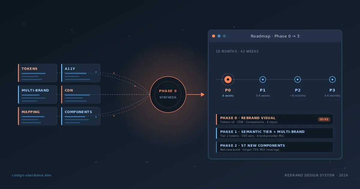
The decision and its roadmap implications
The original rebrand plan had accessibility remediation in Phase 3, after the token migration and the component restyling. The logic was sequential: first you migrate the foundation, then you fix what's on top.
The audit data forced a revision of that sequence.
If Phase 1 migrated tokens but only moved the Tier 1 primitives without adding a semantic layer, we'd be repeating the same mistake with new values. The tokens of the new palette would have different names, but if the MUI theme kept referencing primitives directly, the next person to run the audit would find exactly the same failure pattern — or worse, if the rebrand used the brand's primary identity (black #111111 as primary, yellow #FFB40A as secondary), some values that marginally pass today could fail with the new combinations.
The decision was this: the semantic tokens for text (color.text.placeholder, color.text.label, color.text.disabled) get included in Phase 1 of the token migration, not in Phase 3. Component-specific remediation — the ARIAs, the Avatar, the ProgressBar — stays in Phase 3 when the full library restyle happens. But the infrastructure that prevents the problem at the root goes first.
This distinction matters. The audit didn't accelerate component remediation — that requires component-by-component dev time and it's reasonable to do it in the context of a larger restyle. What it did accelerate was the recognition that building new token architecture without a semantic layer was technical debt from day one.
The conversation went from "we'll fix the components when we have time" to "if we don't put semantic tokens in now, the problem is going to be structural." That's what changed.
What I learned
Accessibility data is architectural argument. I didn't think of it that way before. I thought of axe results as a list of bugs to fix. The audit showed me that when a violation repeats across 80% of components, the interesting data isn't the violation — it's the common cause. And that cause can be an architectural decision you haven't made yet.
Patching symptoms is technically correct and strategically wrong. I could have closed the color-contrast tickets by changing values in 11 MUI overrides. I would have passed the audit. And I would have buried the real problem under a layer of fixes that don't talk to each other and that the next developer will ignore because there's no mechanism that makes them visible. Systems that work are the ones that make the correct error hard to make, not the ones that fix the error after it happens.
Baseline matters before you build on top. We had 15 components with no formal accessibility audit. We had been building new features — more stories, more variants, more complexity — on top of a floor we didn't know was solid. The audit wasn't a compliance exercise; it was discovering the actual state of the system before migrating everything to a new architecture. Without that data, we'd have migrated the problems along with the tokens.
Three components passed cleanly: Dialog, Tooltip, and LogoController. What they have in common is worth analyzing: Dialog uses high-density text colors without exceptions, Tooltip has no secondary text that depends on the problematic tokens, and LogoController doesn't render interface text at all. The lesson isn't "these components are better" — it's that the contrast problem is specifically tied to secondary text roles (label, placeholder, helper), not main texts. That confirms the needed semantic tokens are exactly the ones identified: color.text.placeholder, color.text.label, color.text.disabled.
Conclusion
67.6% WCAG AA failure sounds like a disaster. In some ways it is. But the most valuable thing about the audit wasn't the number — it was what the number pointed to: two token values used in secondary text roles, with no semantic layer to abstract them and no mechanism guaranteeing contrast. The correct fix wasn't patching 11 components but introducing the infrastructure that should have existed from the start.
That turned an accessibility audit into an architectural argument, and that argument moved semantic tokens from Phase 3 to Phase 1 of the roadmap.
The next post in the series documents the concrete technical migration of that Phase 1: how the tokens package was structured with Style Dictionary v4, what decisions were made about tier nomenclature, and what it meant to move 95 primitive tokens to the new palette while introducing the semantic layer this audit justified.