Audit before architecture: how 6 parallel investigations shaped a 10-month roadmap
Before writing a single line of code for our design system rebrand, we spent weeks investigating. This is how six parallel audits radically changed what we were going to build.
The wrong instinct
When the instruction landed — "we need a full rebrand of the design system" — the first impulse was clear: open the editor, swap the colors, update the tokens, commit. A week of work, maybe two.
I didn't do that.
Instead, I spent the next four weeks investigating. Six parallel audits before writing a single line of implementation code. This post documents what we found, why that radically changed what we were going to build, and the main lesson I'm taking from it: audit before designing, design before implementing.
The context
We had a functional design system with three published packages: a design tokens package, an MUI theme, and a component library. We also had a roadmap in motion to expand the library from 22 to ~80 components.
The new brief arrived with clear specs: new color palette, new typography (three fonts instead of one), new brand assets. The entire platform frontend and all product communications had to adopt the new identity.
The question nobody had explicitly asked was: how deep do we have to go? Is this a CSS variable swap, or are there underlying structural problems that the rebrand will expose?
Six investigations, four weeks, one decision
To answer that question on solid ground, I defined six investigation areas that ran in parallel:
| Investigation | Central question | Deliverable |
|---|---|---|
| Token architecture | Does our current structure support the rebrand? | Inventory + gaps + ADR |
| Component gap | What do we have vs. what does the new design require? | Gap map + prioritization |
| Accessibility | Do our components pass WCAG AA? | Violations report + severity |
| Multi-brand | How do we support brand personalization in the future? | Architectural ADR |
| Static assets and CDN | How do assets live today and what is the migration path? | CDN strategy |
| Token migration map | What is the exact mapping from old token to new token? | Full migration table |
Why in parallel: each investigation had cross-dependencies, but they could advance independently toward their conclusions. Waiting for the first to finish before starting the second would have been slower and would have biased the findings — I wanted each audit to reach its conclusions independently before synthesizing.
What we found
1. Tokens: 95 primitives, zero semantic layers
The tokens package had 95 tokens across six categories: colors, dimensions, spacing, radius, shadows, and typography. All Tier 1 — pure primitives, no semantics.
// What existed — direct primitives
import { ColorsPrimary500 } from '@design-tokens'

// ColorsPrimary500 = "#006BF8" — hardcoded business value

// What did not exist — semantic layer
// color.text.primary
// color.background.surface
// color.border.default
The 43 token-consuming files across the three packages imported primitives directly. Changing the palette meant search-and-replace across 43 files. And for future capabilities — dark mode, multi-brand B2B — it was architecturally impossible without a semantic Tier 2 that didn't exist yet.
The good news: Style Dictionary v4, the tool we were already using, natively supports the three-tier architecture. The problem wasn't tooling — it was a design decision that hadn't been made.
2. Components: 21% MUI coverage, and a positive surprise
| Metric | Value |
|---|---|
| Components in the library | 22 |
| Total MUI catalog | ~105 |
| Current coverage | 21% |
| Roadmap target | 75% (~79 components) |
| Components that are thin MUI wrappers | ~18/22 |
The surprise: most components delegated all styling to the MUI theme. In theory, updating the theme should automatically restyle most of the library. Confirmed in the audit: only 6 components required visual changes beyond the theme. The rebrand wasn't going to be 22 components rewritten — it was going to be 1 updated theme file with 6 additional manual adjustments.
The notable exception: the LogoController component bundled brand assets directly into the package. That would have to change once we implemented the CDN strategy.
3. Accessibility: 67.6% failures and an unexpected cause
This was the finding that changed our plan the most.
| Metric | Value |
|---|---|
| Stories audited | 105 |
| Passing WCAG 2.1 AA | 34 (32.4%) |
| Failing WCAG 2.1 AA | 71 (67.6%) |
| Components affected | 12 of 15 (80%) |
| Dominant violation | color-contrast |
| Components passing fully | 3 (Dialog, Tooltip, LogoController) |
80% of the violations came from a single cause: two token values. neutral.400 (#9F9F9F, ratio 2.85:1) and primary.750 (#677897, ratio 3.8:1) — both below the WCAG AA minimum of 4.5:1.
The critical conclusion: it wasn't a component problem, it was a token problem. Patching 12 components individually would have addressed the symptom. The correct fix was adding a semantic Tier 2 with values that respected contrast at the root. Without that Tier 2, any accessibility fix would be fragile: the next developer to change a token value could break contrast without realizing it.
4. Multi-brand: the ADR that defined Phase 1
The brief included a business requirement for the future: B2B clients must be able to inject their own brand into embedded iframe components, scoped to the container, without leaking into the host.
We evaluated four technical approaches. The decision: CSS custom properties on the semantic Tier 2 as the runtime override surface.
/* Semantic Tier 2 — generated by Style Dictionary, emitted as CSS vars */
:root {
  --color-text-primary: #111111;
  --color-background-surface: #FFFFFF;
  --color-border-default: #E5E5E5;
}

/* B2B client brand override — injected at runtime, no redeploy */
[data-brand="acme-corp"] {
  --color-text-primary: #1A2B3C;
  --color-background-surface: #F8F9FA;
}
The problem: this Tier 2 didn't exist yet. The ADR and the technical design existed, but implementing it during the rebrand would have meant rewriting the 43 token-consuming files at the same time as swapping the entire palette. Too much risk inside a 4-week window.
Decision: the ADR stays signed and documented. Phase 0 does the Tier 1 swap. Phase 1 builds Tier 2.
5. Static assets: a brand that required a redeploy
All brand assets — logos, banners, icons, state images — lived bundled inside four repositories. A brand change required commit + PR + deploy in each one.
The audit identified ~175 files in total distributed across the repos, with two SVGs of critical size that consumed unnecessary megabytes. The recommendation: a dedicated assets repository that mirrors directly into S3 + CloudFront, with versioned paths /v1/ and /v2/. The brand cutover would become changing an environment variable. No redeploy.
This architecture also decoupled the asset lifecycle from the code lifecycle for good.
6. Token migration map: 95 → 61, plus additions
The design team delivered a token-by-token migration map. 61 tokens in the new palette vs. 95 current ones. The most significant changes:
| Category | Before | After | Type of change |
|---|---|---|---|
| Primary colors | 11 blue shades (#006BF8) | Neutral + black scale (#111111) | Full rewrite |
| Typography | Montserrat (1 font) | DM Sans + Inter + JetBrains Mono | 3 fonts with distinct roles |
| Font weights | 8 weights (100–900) | 4 weights (400–700) | 4 removed |
| Dimensions | 22 values | 11 values | Simplified scale |
| Status colors | success/warning/error/extra | Green/Yellow/Red/Tertiary | Renamed |
| Alpha colors | — | 5 new (rgba overlays) | New category |
| Stroke | — | 4 new (1–6px) | New category |
With the map delivered, the technical migration was direct. The uncertainty was no longer "how much changes?" but "in what order and with what risk?"
From findings to roadmap
With the six audits complete, the synthesis revealed three patterns that weren't obvious before investigating.
Pattern 1: Everything converges on Tier 2. The token audit identified its absence as technical debt. The accessibility audit identified it as the root cause of 71 violations. The multi-brand ADR needed it as the override surface. Three independent investigations, same conclusion. When a pattern emerges from multiple angles without coordination, it's hard to ignore.
Pattern 2: The existing roadmap was correct, but it had an unstated precondition. The plan to expand the component library was good engineering. The problem: building components on the old palette meant having to redo them when Tier 2 arrived. We needed the new foundation before building on top. The solution wasn't to throw out the roadmap — it was to add a prerequisite.
Pattern 3: The rebrand was more than colors and fonts. It included CDN strategy, asset migration, breaking changes in four repositories, and the foundation for capabilities that didn't exist yet. "A week or two" was an estimate against the wrong problem surface.
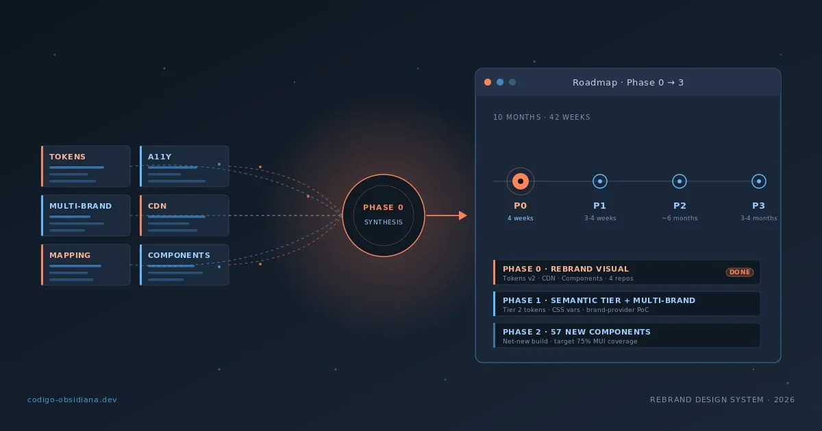
The resulting roadmap
Phase 0 — Visual rebrand (4 weeks, 1 dev + AI)
├── Week 1: Tokens v2 + MUI Theme v2 + Fonts
├── Week 2: CDN infra + Optimized assets + CI/CD pipeline
├── Week 3: Component restyle + Migration of 4 repos
└── Week 4: Cross-repo QA + Release + CDN cutover

Phase 1 — Semantic tier + Multi-brand foundation (3–4 weeks)
└── Tier 2 tokens, CSS vars, brand-provider PoC

Phase 2 — Net-new components (~6 months)
└── 57 new components → 75% MUI coverage

Phase 3 — Advanced capabilities (3–4 months)
└── A11y remediation, visual regression, multi-brand runtime
Total Phase 0–3: ~42 weeks of effort / ~10 months with a full team.
The most important thing about the phase design: everything that came out of P0 had a phase assigned. It wasn't "this doesn't matter," it was "this comes in Phase 1" or "this comes in Phase 3." Saying when is the difference between a backlog and abandonment.
Four weeks of planning, four of execution
Phase 0 landed on May 11, 2026. 274 commits, 50+ PRs, four repositories updated, three packages on stable v2.0.0, and a new dedicated assets repo with 76 files on the CDN.
The original PRD documented 9 breaking-change patterns. The reality was 26+ categories. That wasn't a planning failure — it was the expected result of executing a full identity change in a real system with years of use behind it. The audits had calibrated risk and complexity correctly; the exact dimension of scope only becomes visible during execution.
The next posts in the series document the technical execution: the token migration, the CDN architecture, and the coordination of the breaking-change release across four repositories.
What I learned
Audit before designing, design before implementing. Four weeks of investigation prevented building six months of components on the wrong foundation. The cost of reversing the order — build first, audit later — would have been redoing work already done.
Parallel audits reveal patterns that sequential ones hide. If the token audit had finished before the accessibility one started, it would have concluded "we need Tier 2 for architectural reasons." With both in parallel, the conclusion was "we need Tier 2, and there are 71 accessibility violations that confirm it from another angle." A technical argument plus a user argument is significantly harder to defer than either one alone.
"Not now, but in Phase 1" is better than including everything. Semantic Tier 2 was necessary and correct. Just not in Phase 0. Having well-defined phases turns scope creep into deliberate roadmap decisions. Everything that went into the Phase 1 or Phase 3 backlog was an explicit decision, not an omission.
Existing roadmaps have value, even when they need to be reorganized. The component plan we had was good engineering. We didn't throw it out — we re-sequenced it. The distinction between "this roadmap is wrong" and "this roadmap needs a precondition" completely changed the internal conversation about priorities.
Conclusion
Rebranding a design system is tempting to solve with urgency. Visual changes are tangible, feedback is immediate, there's business pressure to see the new identity on screen.
The discipline of auditing first doesn't kill that urgency — it channels it. Four weeks of investigation gave clarity on what was a surface swap, what was accumulated technical debt, and what was infrastructure that didn't exist yet. Without that clarity, we'd have built on a foundation we already knew we were going to change.
The next post in the series digs into the finding that surprised me most: the accessibility audit that revealed 67.6% of our components were failing WCAG AA — and how that data became the strongest argument for an architectural decision that had been deferred for months.